
MICROSOFT POWER BI
Improving Mode Awareness in Power BI’s Edit Mode.
Duration
3 months
Team
(me) Designer + User Researcher, (1) Project Manager
Contributions
User Interviews, Usability Testing (Moderated), Research Analysis, Ideation
SUMMARY
Redesigning Power BI’s edit mode to improve mode awareness, reduce cognitive load, and streamline editing workflows.
Explored how users interact with Power BI’s Edit Mode to identify friction in column editing workflows. The outcome helped Microsoft rethink how mode awareness and system state clarity are communicated across the product.
Improved mode awareness and reduced user friction by designing a lightweight, familiar control for switching between View and Edit states.
PROBLEM SPACE
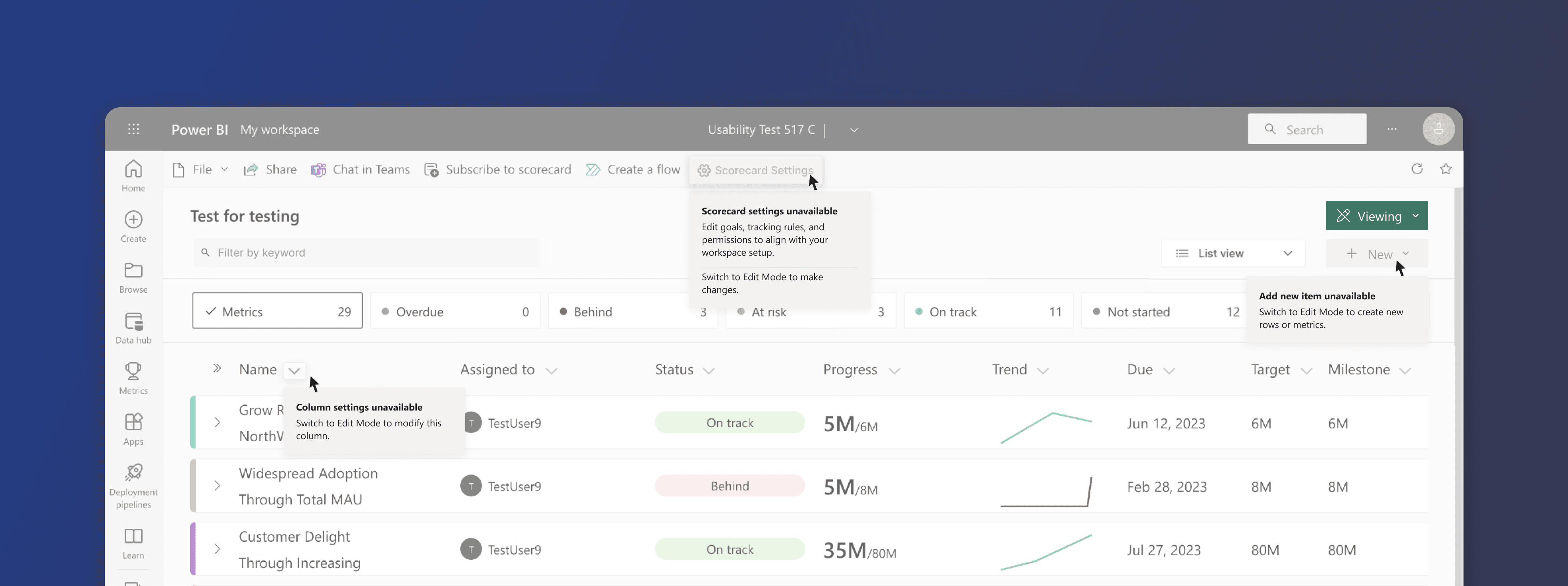
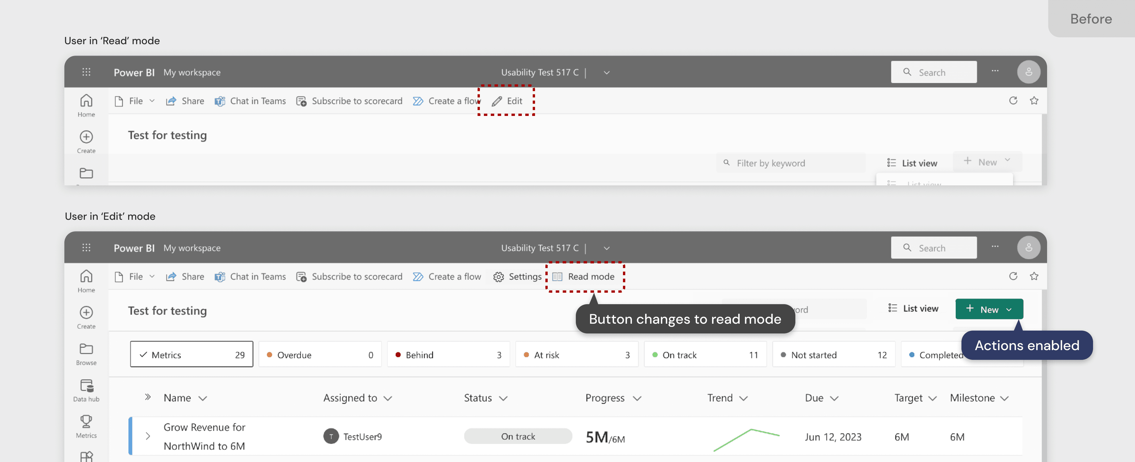
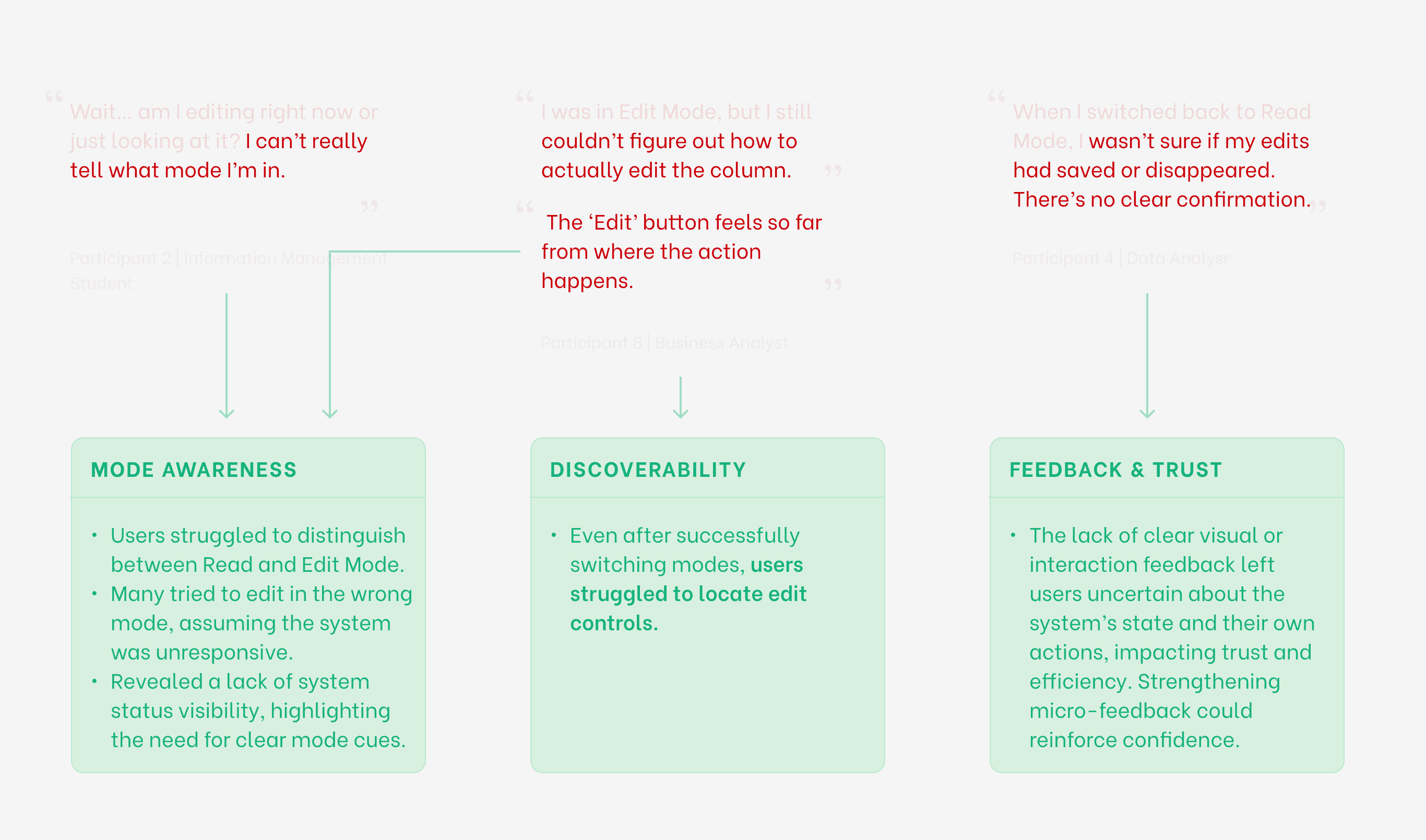
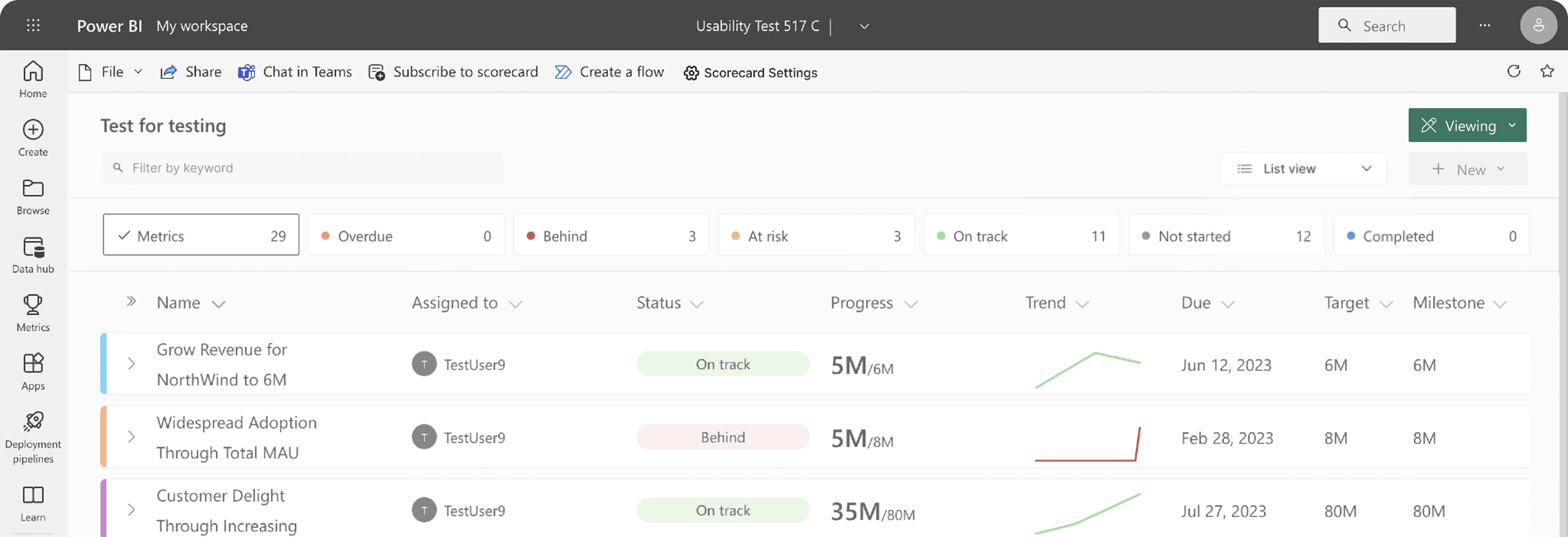
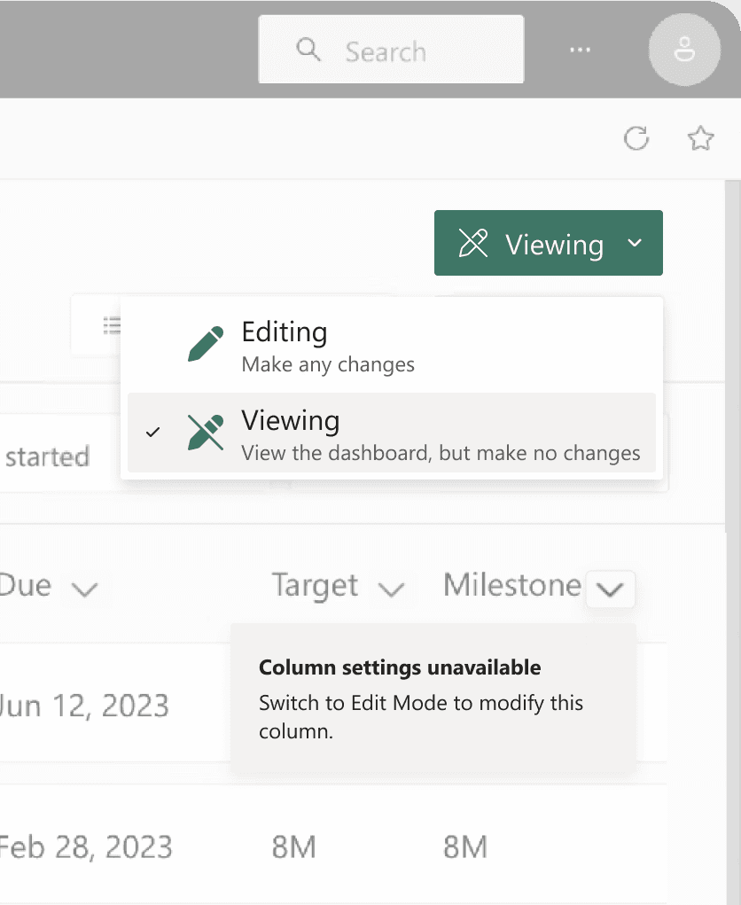
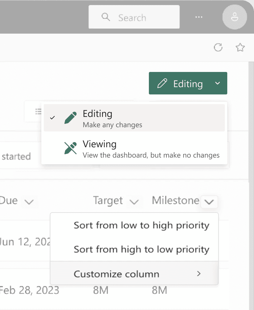
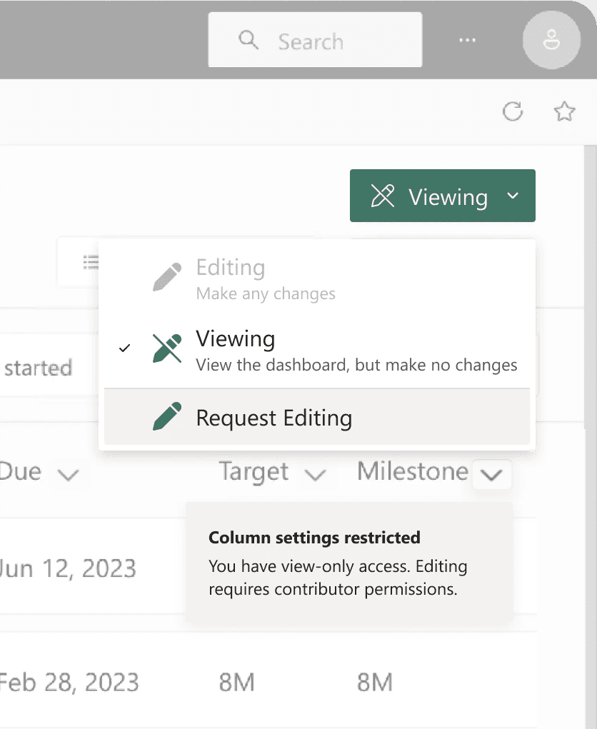
Users often didn’t realize whether they were in View or Edit Mode.
The edit mode and nested column settings are not intuitive, relying heavily on users' recall ability. This makes it challenging for new users to navigate and remember the nesting structure.
PURPOSE
INSIGHTS & OPPORTUNITIES
Testing revealed that modes weren’t the issue—invisible modes were.
The tasks were derived from the research questions and centered around the findability of certain features such as 'Compact View', Edit Mode, and Column Settings.
DESIGN PROCESS
Explored lightweight patterns to clarify state without crowding the canvas.
EXPLORATION 1
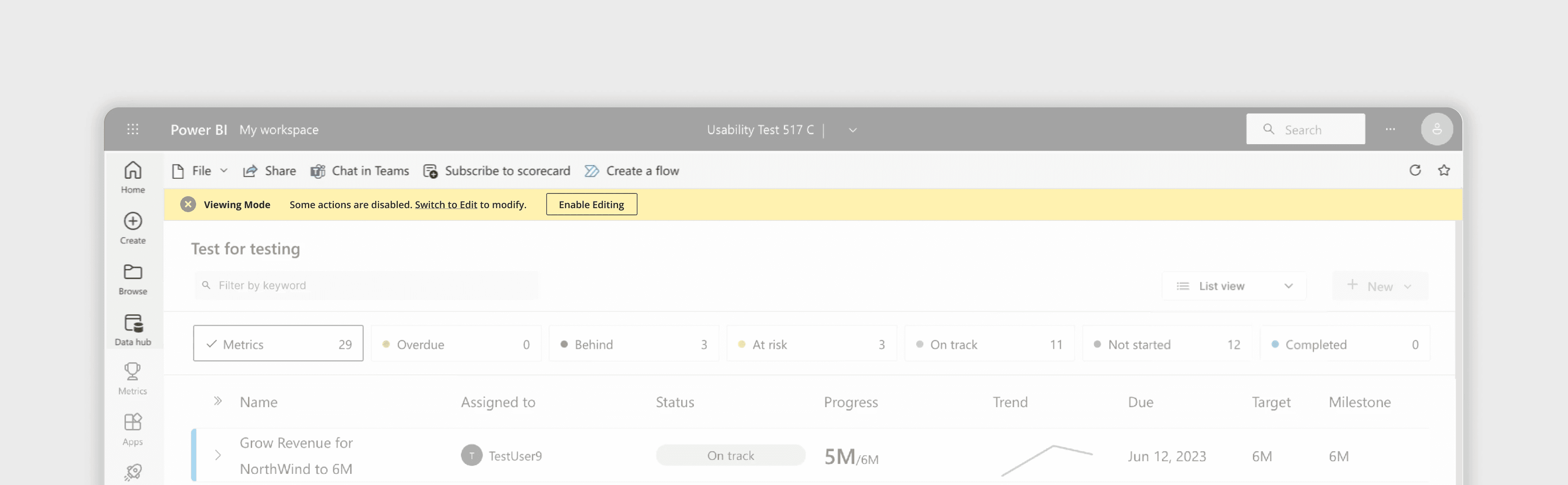
Teaching Banner
A lightweight banner (similar to Word/Excel) that appears the first time the user enters View Mode or Edit Mode.
REFLECTIONS
Clear but Space-Heavy
The banner delivered strong clarity, but it consumed valuable screen real estate in an already dense workspace.
Best for One-Time Education
Useful for onboarding, but too intrusive to serve as the primary, persistent mode indicator.
EXPLORATION 2
Mode Indicator + Mode Switch Control
1
Button Dropdown
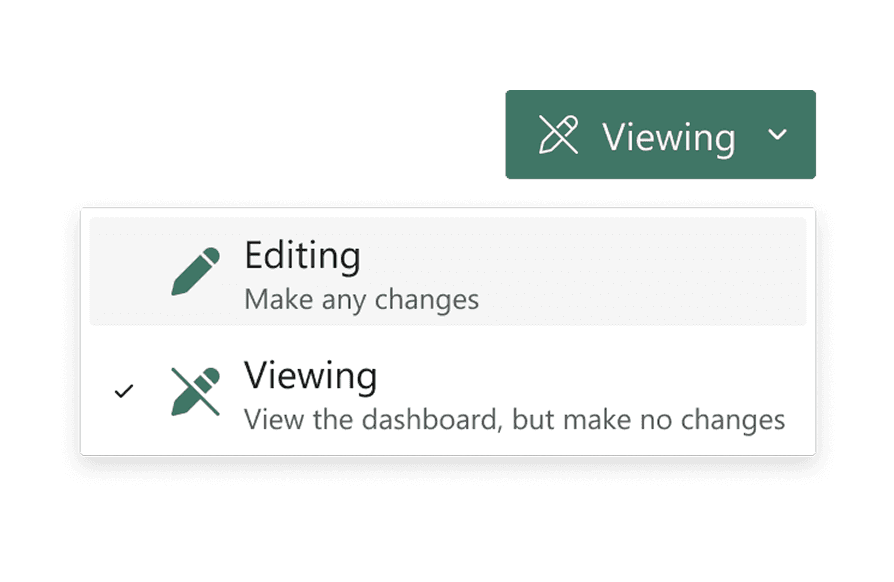
Low learning curve, fits seamlessly into Power BI’s toolbar patterns.
2
Capsule + Dropdown
Useful for constant visibility, but slightly repetitive.
3
Toggle Switch

Users mistook it for a “view formatting” toggle.
REFLECTIONS
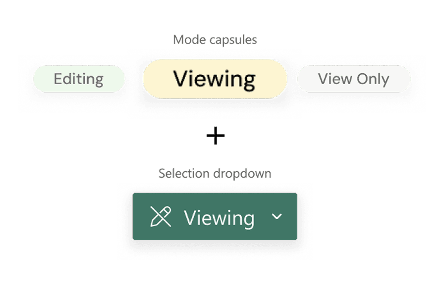
Clear button dropdown
Made the mode change obvious and avoided the confusion seen with toggle-style controls.
Lightweight, scalable UI
It integrated cleanly into Power BI’s existing toolbar without adding visual noise.
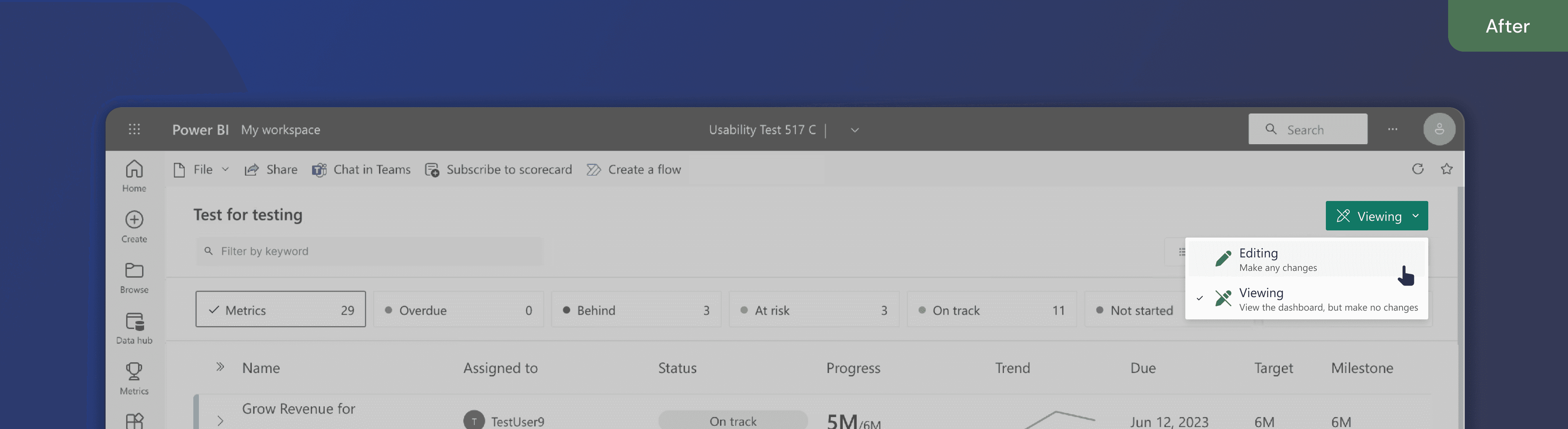
FINAL PROPOSED DESIGN
New View & Edit Mode Controls
A dropdown switch aligns with Microsoft’s patterns, making it easy for users to move from View → Edit with confidence.
Mode Change Micro-States
1
View mode
2
Edit mode
3
No edit access
IMPACT + INFLUENCE
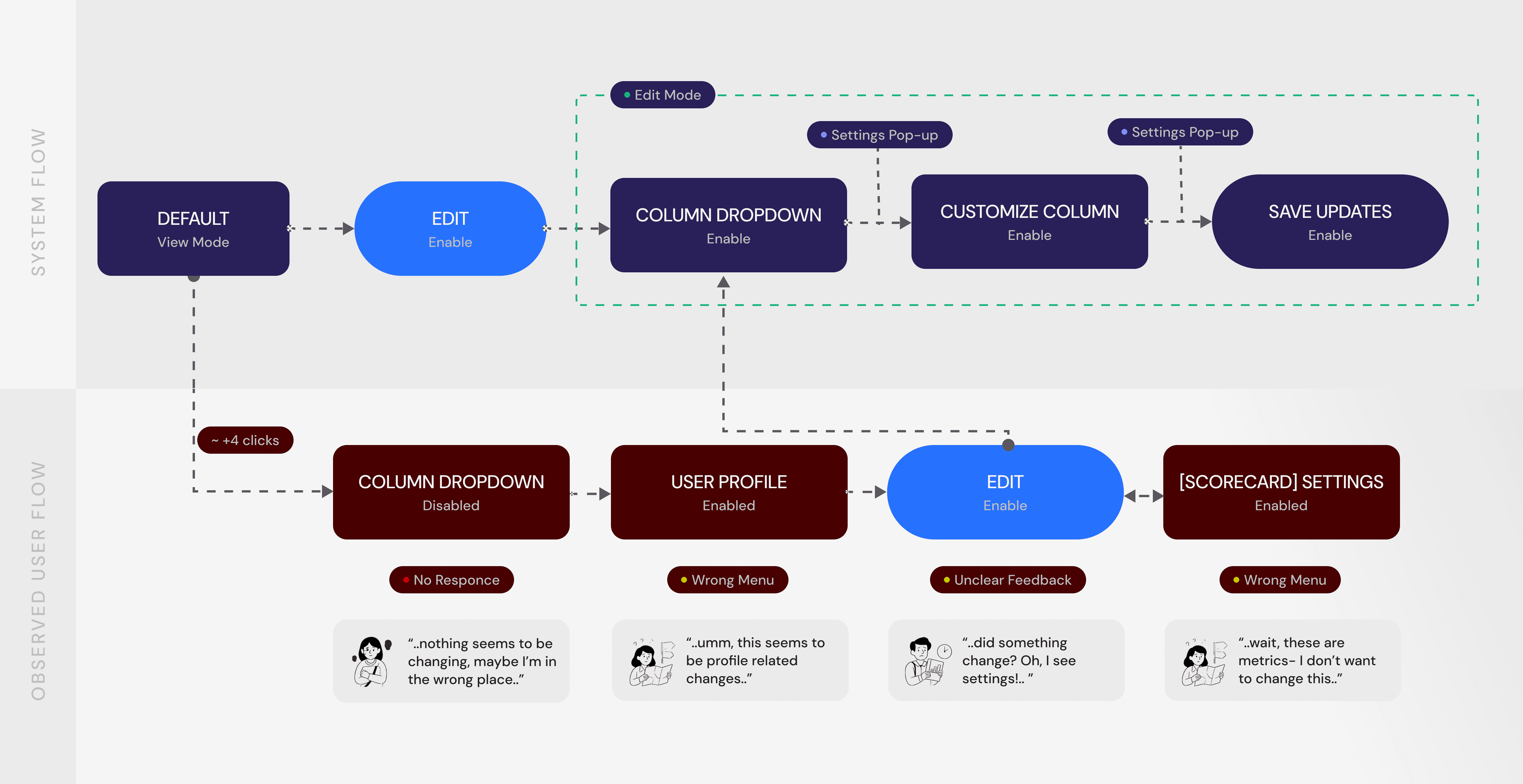
2m 40s to under 1 min, average time to complete editing tasks.
The hybrid pattern reduced task time by 60 % and improved confidence in testing. More importantly, it prompted Microsoft to re-evaluate how mode states are surfaced across Power BI.
~60%
Lesser misclicks
Around column settings and unrelated menus.
7 to 2
Clicks to make edits
Decreasing average time to complete editing tasks
95%
User felt confident
When navigating between View and Edit Mode.

